Didi 34
2006 January 5
Racer-cruiserr
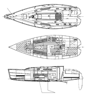
The 34 does not use conic development but it does use flat panels for the topsides and bottom connected by a radiused chine, resulting in an almost round-bilged boat. This can be confusing. Chine means a corner in the hull section. So imagine this hull built with a hard chine or corner just below the DWL amidships, kind of like a Star boat, Lightning, Geary 18 or Snipe. Now, knock that hard edge off with a large radius panel that is laminated, cold molding-style, over the frames. Unlike the FairWind, the Didi is not conically developed. There is very little twist in the flat panels and Dudley's use of multiple longitudinals gives him the control element needed to gently force the plywood panels to conform to his will. The next time you see a very modern racing yacht look at how flat the topsides panels are. I would guess that if you saw a Didi 34 at the dock you would not guess that the shape came from flat panels. The D/L is 135 and the L/B is 3.08. Draft is available at 6 feet, 3 inches or 4 feet, 11 inches. The most unusual feature of this hull is the way the rudder has been notched into the run of the boat. I have to think this was done to make the boat easier to build.
 The layout is fine. It's kind of ordinary but it's designed around the centerline engine box/galley counter combination and that pretty much controls your options. Besides, we have so many wacky layouts available now that a nice orthogonal layout looks good to my eye. Having to work in the engine box with the galley works to the benefit of the galley. It's a nice, big galley for a 34-footer.
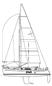
The idea behind this design was a boat you could club race or cruise. The rig is a tall fractional rig with double spreaders swept 20 degrees. The SA/D is 18.7. This is pretty sedate for a boat you would race but just right for a family cruiser. This is a very handsome boat but it doesn't help me to appreciate the way it is drawn going from right to left. Is this silly? No. Try this experiment. Get a sailplan of a boat; the bigger the print the better. It will be drawn going left to right. At least 99.9 percent of them are. Now turn the print around so the boat is going from right to left and hold the print up to the light so you can see through the paper. Notice anything? Right. It looks like a different boat. Don't ask me why but almost everyone experiences this the same way. Going right to left the bow looks higher and the sheer spring more exaggerated. Dudley agrees. He likes the way they look better going right to left. I think they look more like the finished boat when they are drawn going left to right. It's a very small point but I have worked hard for 40 years trying to get my drawings to accurately represent the finished product. This is in no way a criticism of Dudley's design work, only his style of graphic representation.
So you need a project this winter. Call Didi and buy some plans for this 34-footer. Dudley's drawings are redolent in detail and beautifully drawn. Dudley knows boatbuilding and is very practiced at walking home builders through all the steps on the way to a finished boat. The world of "stock plan" designs can often show us some grim examples of the yacht design art/science. Dudley's work is top notch.

Comments