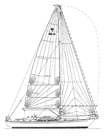
Morris 46
Bluewater cruiserr
I'll tell you one of my favorite Chuck Paine stories. In 1973 Chuck and I both worked for Dick Carter in Nahant, outside of Boston. Dick had a fabulous house right on the water and our office was in a 14-foot-square, concrete, five-story, submarine watchtower. Each floor measured inside 12 feet by 12 feet and we used ladders to get from floor to floor above the second floor. We had an amazing view of the Atlantic. Chuck worked on the fifth floor and Mark Lindsay and I worked on the third floor with Yves Marie Tanton. My take-home pay was $157 a week, but I was sure happy drawings those Carter designs.
One day I was looking over Chuck's shoulder as he worked on a drawing. I was silently marveling at his drafting skills.
"I love the way you draw," I said. "I try to make my drawings look like your drawings."
Chuck replied, "Oh really? I try to make my drawings look like your drawings." That was probably one of the nicest compliments I ever received of my work. In those days before CAD, hand-drafting skills were very important to both Chuck and me. Pencil or keyboard are both only tools so it's really not important, but I thought I'd bring it up because these drawings, excluding the deckplan, are obviously hand drawn. You have to look very carefully but I assure you the hand of man is at work here. Analog rules. Vinyl forever!
This Morris 46 has Maine written all over it. The styling is absolutely classic Northeastern yacht. The overhangs are drawn out. The transom is small. The sheer is strong and the bow has a delicate spoon profile. The center cockpit configuration poses some aesthetic problems to the designer and I don't think Chuck conquered all of them. Few designers ever do. Given headroom requirements and the constant battle with cockpit volume and seatback height requirements, the end product is always an aesthetic compromise.
Hand me a pencil. I'll fix this profile in a heartbeat. Of course you will loose headroom. The cockpit will look like a mini hot tub and the seat back will hit you right in the kidneys. One solution is to raise the freeboard, flatten the sheer and adopt a more contemporary look all together. But that's not this boat, and the styling tone of this boat is its moderate freeboard and strong sheer spring.
Another critical consideration for you armchair designers is the fact that when you pull the entire boat into one flat plane as a two-dimensional representation, you loose aesthetic three-dimensional accuracy. While the drawing may be technically accurate, it's still aesthetically misleading. Photos of the Morris 46 show a great-looking boat. It's a Paine design. Of course it looks good.
The interior layout shows the galley in the passageway leading to the aft cabin. This is a well laid-out galley with plenty of counter space on each side of the sinks and the range. The nav station is generous in size. The staterooms in the ends of this boat are not huge and remind us that we are dealing with a boat with DWL 2 inches longer than a Valiant 40. There is a good-sized lazarette.
The D/L of this design is 288 and the L/B is 3.6. Draft is minimal at 5 feet, 6 inches. There is very little "balance" to the deep skeg-hung rudder. In plan view you can see that there is far less beam aft in this design than in most new designs. This shape is part and parcel of the approach. A big, wide transom on this design would look awful.
Morris Yachts will undoubtedly do a fabulous job on this design.

Comments