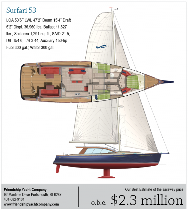
Surfari 53
 I was on the phone to Ted Fontaine's office speaking to a nice young lady. I can't remember why I called but she said that I might be interested in a new design Ted was working on. She went on to sort of describe it and said it was the boat Ted would want for himself. I'm a big Ted Fontaine fan so I thought this sounded exciting. My imagination went to work. Then I got the material on the new design, the Surfari 53. It was not what I expected. I was a bit surprised and honestly I was disappointed. But I had been expecting something very Fontainy, that is to say something very classic and yachty in the East Coast style. I'd put Ted in a box, and it was obvious Ted was trying to bust out of that box.
No chines? Holy cow. But the hull does have a hard turn to the bilge and a very flat run for good speed under power. With any heel angle that big broad transom is going to dig in and create some drag. But wide sterns are "the thing" these days so Ted is far from alone with his wide fanny. With that broad stern you get the twin rudders so one rudder stays immersed when the boat heels.
There are two keels listed, one drawing 6 feet 9 inches and the other a lifting keel drawing 8 feet 9 inches, and I assume that means keel down. The D/ L is 154.56 so this is not a heavy boat by any standard. The sheer has an attractive and subtle sweep and there is enough bow overhang to give the hull an elegant look.
The most unusual thing about this layout is that the sole level in the raised saloon is the same level as the cockpit sole. This will make the entire aft end of this boat feel like one huge integrated area. Sitting in the saloon you will make easy eye contact with people sitting at the cockpit settees. There is no companionway ladder or even steps to deal with. That sounds good to me.
The price you pay for the integrated area is a very high cabintrunk over the saloon. Ted has dealt with this in a contemporary way using those bold, curved corner elements and a nearly all glass cabintop. There is a lot of shaped glass in this structure. I'm not wild about the look. This does not make it bad, just that it means my eyes have not caught up with this look yet. In time who knows? Off the top of my head, with that much height to deal with I can't think of a gentle or aesthetically pleasing way to do it myself.
Sometimes in the design business we say, "If you can't hide it, highlight it." Ted has highlighted it.
This is a very interesting layout. The covered part of the cockpit becomes an extension of the saloon and features port and starboard seating with dining tables. In the saloon a huge galley is to starboard and a dining area to port. Down some stairs forward are three staterooms and two heads. The owner's stateroom forward has a centerline with double flanking settees. I don't see a hanging locker in the owner's cabin. Neither head has a separate shower stall but the heads are quite spacious. The guest staterooms have stacked single berths.
Side decks are minimal on this design. That allows for the huge, raised saloon. I find it odd that there is no seating at the twin helms. I suppose you could sit on the side deck but given the comfort focus of this design I would expect comfortable seating at the wheel.
"Here Bob. Sit on the spinnaker bag."
The rig features a fat-head main and no standing backstay. I think it would be asking a bit much to have people controlling running backstays on this design. The aft vector for holding up the rig is provided by the swept spreaders. The SA/D is 21.5 using the entire mainsail area and 100% of the fore triangle. A short bowsprit will make it easier to jibe the asymmetrical chute.
But who needs to sail when you have twin 75-horsepower Volvo diesels with saildrives. There is tankage for 300 gallons of fuel and that should shoot you along for well over 1,200 miles. There are also 300 gallons of water and 60 gallons of holding.
I'll watch this project with interest. I can't think of another boat just like this one. Maybe some of Bill Dixon's current designs are close. But Ted has his own unique approach to the styling challenge. Good on ya Ted for being bold.

Comments